Fun with Digital Royalties | The Cynical Musician

The excellent blog “The Cynical Musician” has accepted our challenge to debunk the  latest Berklee College of Music/Rethink Music set of flow charts on digital music royalty flow.  Really excellent work by Faza. It’s devastating to Berklee.  Check it out. While this whole exercise has been fun for us,  it has to be embarrassing for a $60k a year academic institution that offers a degree in the “music business” to demonstrate that they fundamentally do not understand how digital royalties work.  

The Trichordist posted a challenge to disassemble Rethink Music’s royalty chart today and I do so love a challenge. I won’t be pasting the whole of it – just the juicy bits – so make sure you read their post.

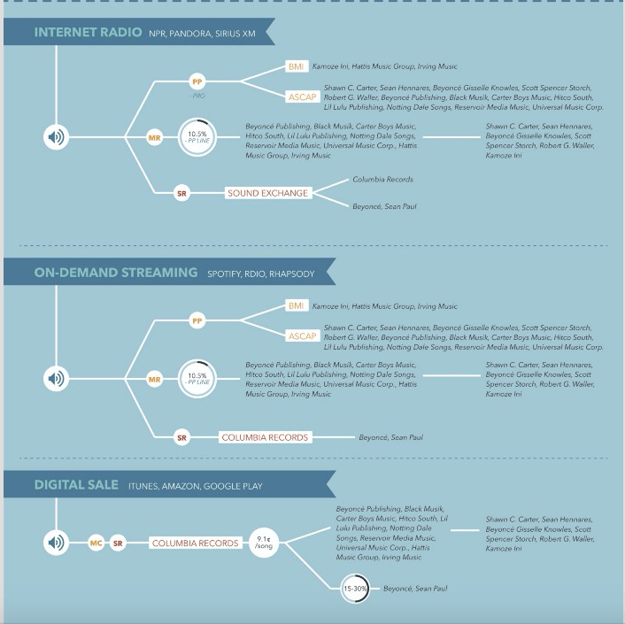
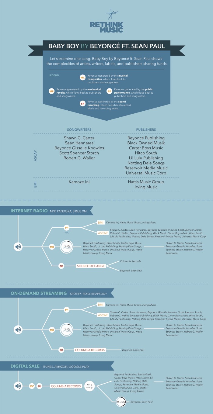
Let’s start with the breakdown of internet radio royalties:

Read the Full Post :  Fun with Digital Royalties | The Cynical Musician.

$100 Dollar Prize! Be First To Illustrate all the Flaws in this @BerkleeCollege of Music Chart


Screen Shot 2015-08-07 at 11.52.32 PM

MC = musical composition, SR = sound recording, PP = public performance, MR = Mechanical Royalty (by which they really mean the so called “streaming mechanical” ).

Berklee College of Music/Rethink Music just issued a rather defensive follow up  in response to our criticism of their original Kobalt Music/Google Ventures funded report on fair pay and transparency in the music business.

Well we must confess we’ve been laughing our asses off all day at these guys. Why? Because while Allan Bargfrede and Panos Panay have been busy taking the low road by suggesting we are luddites and comparing us to “birthers” (WTF right?), they’ve also been distributing digital royalty flow charts that are completely wrong . Guess they thought we stupid and ignorant artists wouldn’t notice.

There are at least two major errors in the flow charts above, maybe more depending on what the authors were trying to illustrate (it’s actually not clear).   I teach a music publishing and digital royalties class at UGA.    I teach undergraduates but I guarantee you that after week ten 90% of them will be able to spot the errors in these charts. I will be using these faulty charts on my tests in the fall!

So look I don’t want to come out and explain what’s wrong here. Let’s have a little fun here.  First person to most accurately describe the flaws in this chart and submit a hand drawn “markup”, chalk, paper or whiteboard illustration of the errors gets $100 “professor whiteboard” prize!  We will publish winning submission here.

Here is a link to a higher res copy.

flawed rethink music followup

http://web.archive.org/web/20150808043822/https://medium.com/@allenbargfrede/music-paid-fairly-5df29f2b3924